Old Town Commercial Association
A refreshed brand identity that honors Old Town’s history and independent spirit while creating a more cohesive, polished presence for its future.
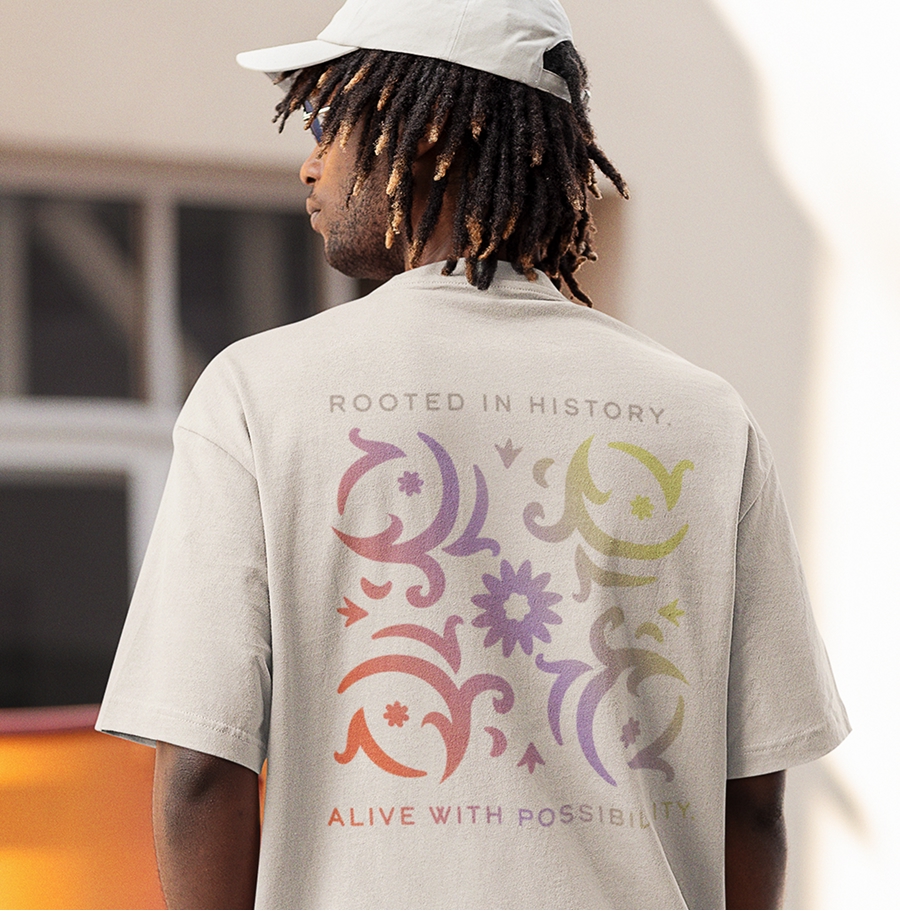
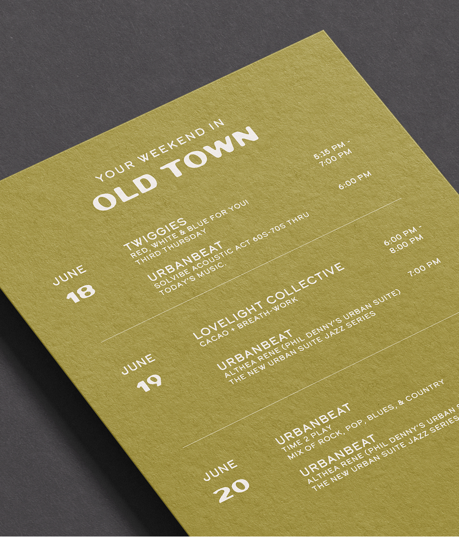
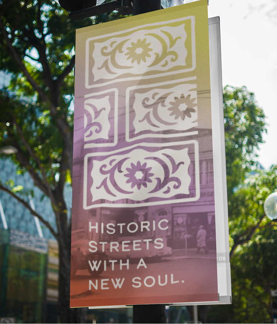
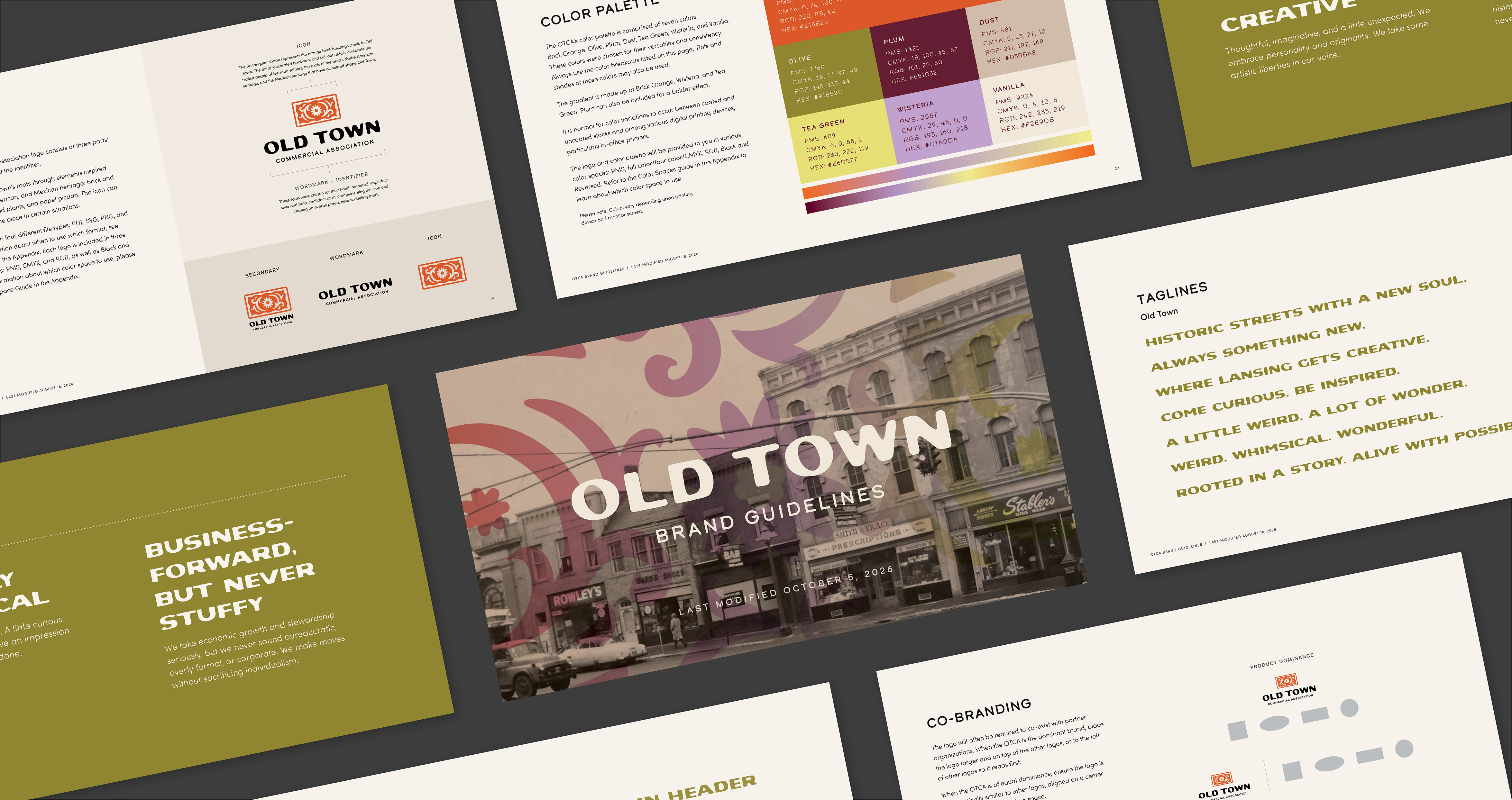
Approaching its 30th anniversary, the Old Town Commercial Association sought a refreshed identity that reflected both where the iconic Lansing district came from and where it is headed. Redhead developed a condensed brand platform and complete visual identity that connects the OTCA to the distinctive place and story it represents, balancing historic character with creative energy and forward momentum.
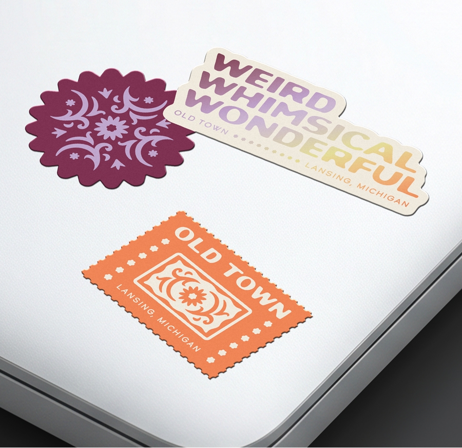
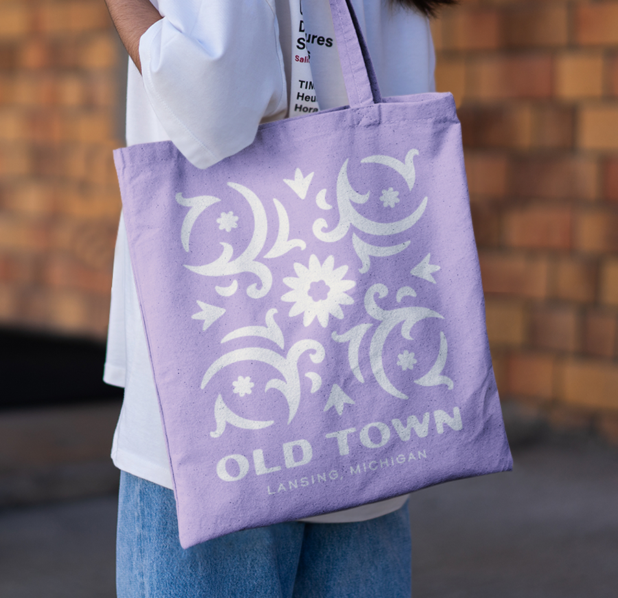
Inspired by Old Town’s multicultural roots, the new visual identity incorporates cues drawn from brick and craftsmanship, nature and plants, and papel picado. A flexible icon, vibrant palette, typography system, and practical brand tools give the OTCA a cohesive presence across its communications while preserving the district’s unmistakable personality.